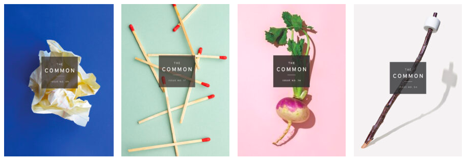
A crumpled wad of paper, scattered matches, a turnip, a marshmallow on a stick—The Common’s minimalist covers feature objects set against bright backgrounds. From an axe to a sudsy bar of soap, the thing that appears on each cover is drawn from a story, poem, or essay in the issue and could be recognizable anywhere. This parallels the mission of The Common—to bring together a community of writers and readers from around the world and to deepen our individual and collective sense of place.
In my three years working for The Common I’ve done every sort of task that you could imagine feeds into the functioning of a literary magazine—except, perhaps, design. And while, thumbing through bookstores or libraries, I have certainly pondered what makes a book cover work (this is perhaps just a way of saying that I’ve judged a few books by their covers) it wasn’t until recently that I began to wonder how this might be different for literary magazines, which collect voices across genres, and may accumulate dozens of issues over the years or even decades of their existence. How can covers for a single lit mag feel both cohesive and distinct from one another?
On the occasion of The Common’s 15th year and the launch of our 29th issue, which sports a bright whole lemon against a lime-green background, I sat down with Gabriele Wilson, the brilliant eyes behind the magazine’s design since its founding, in order to learn more about the process of creating our covers.
Kei Lim: Can you tell me about how you came to design for The Common and talk me through the process of first developing the cover concept?
Gabriele Wilson: Jen (The Common’s editor-in-chief) and I met when we were both working for Knopf. I was in the design department, and she was in editorial. When she founded the magazine a few years later, she contacted me. At that time, there was little to go on other than that idea of a collective sense of place, where all these writers would come together. I started with the logo. I was thinking of the black square with the typeface in it almost as a very simple, pared down version of the town square. And the idea of a meeting point where all these writers go and think. I tried a lot of different approaches, but in the end, this is what felt like it would work well on any kind of cover, whatever the cover direction was—it could sit over the image and be readable and immediately center the design.
With this mission of a common sense of place, I wondered if there could be a common object as the cover.
But then I was thinking, how can you sum up all these pieces of writing into one singular image or one concept? You know, when you read a book, of course there are a million images, a million ideas that come to mind. But what is a pared down image or concept that will work for all of the pieces? I think in the very beginning, I thought maybe there’s an image of a town square in different countries, but it just didn’t look very good. But with this mission of a common sense of place, I wondered if there could be a common object as the cover—I just love the idea of using very ordinary objects that everybody can relate to.
KL: When you photograph the issue covers, do you shoot them against the background colors themselves, or do you shoot them against any solid background before going into a program like Photoshop and changing the background color?
GW: I do shoot them directly on colored backgrounds. In New York, there was this amazing art store called Pearl Paint on Canal Street that sadly went out of business. But before that, they had this huge sale of gigantic Pantone chips—which are like enormous pieces of construction paper but in really beautiful colors—for one dollar each. So I grabbed like 40 of them, and I’ve shuttled them around with me from New York to Berlin to all the different places I’ve lived, and I’ve used them as the backgrounds for the photoshoots that I’ve done for The Common.
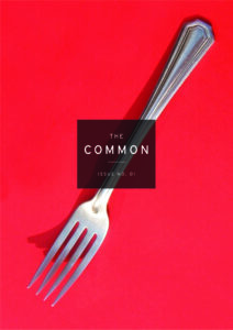
KL: So you began the first issue with the fork, which is a very clean cover, with the fork centered diagonally across the page. How did this pave the way for the following issues? And how and when did you decide to depart from this?
GW: I think in all the cases, I was trying to stay with the theme of the singular object, or the sparseness of the objects, to address that the issues feature writing from people from all over the world, yet these are things that everyone can recognize. But by Issue 5, I started experimenting with numerous objects. I was thinking, maybe we need to open this up—The Common could go on for years and years, and I don’t want to be stuck with only one object. So I ordered this huge bag of old typewriter keys on eBay. And Issue 7, the close up of a bike, was also a departure.
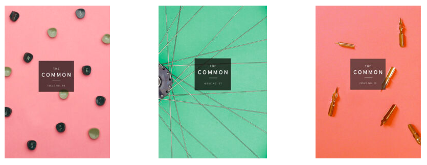
Issue 10, the one with the pen nubs, was a lot like the typewriter approach. I wanted to repeat those multiple objects, repeat a few close ups, so that there were more options for the design as it grew. With a series design, you have to really think about many issues at once when you set up the template of how it’s going to look. At the very beginning, I mocked up a rough idea of many of them to show Jen where these might go.
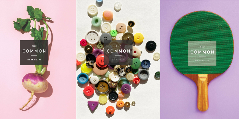
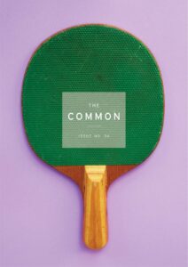
One thing that might be interesting is the one with the ping pong paddle, Issue 6, because the black logo didn’t work over it. It just got lost. And so I thought, you know what, I’m going to try to open up the series to have a light logo. We haven’t gone back to that, interestingly, but maybe there will be another opportunity for it.
KL: What is the actual process of shooting the cover like? We ultimately select two images—one for the front, and one of the object changed in some way for the back—and they always end up so crisp. But I know you must take many more photos than just that. Which have been the most challenging? And do you ever have to composite parts of photos together, or do anything beyond basic edits like fixing exposure or saturation?
GW: The food ones are really fun to look at—like Issue 16 with the popsicle, Issue 18 with the coffee, Issue 20 with the cake—but they’re really hard to shoot. The popsicle was melting so fast, I think it did need a bit of cleaning up in Photoshop. I might have moved a few buttons around in Photoshop for that cover. The most recent one, the lemon, was a little hard because the color was so bright and I had to play with Photoshop a lot to keep it from being overly saturated. But actually, most of them, I would say, are genuinely pretty untouched.
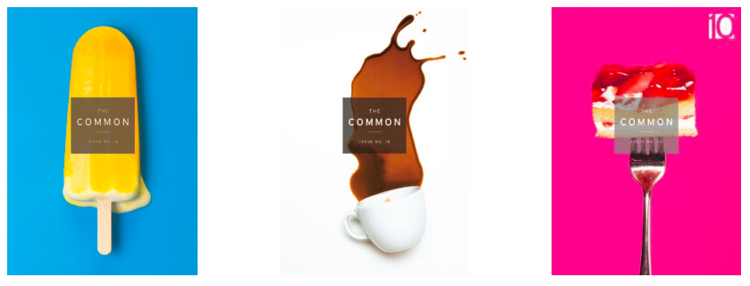
There are aspects of the coffee cup cover (Issue 18) that bother me actually—I don’t like how you can’t see the coffee flowing out of the cup, but it was too difficult to get it to look that way. So the coffee cup is actually just laying over the stain that it made, which I have mixed feelings about. But with food, things just dry up, or start to look disgusting.
Like the cake one, you would never know how much went into making it look like that. There were so many cakes that I bought and had to go through to get to that shot. So many were ruined or fell off the fork. Actually, Issue 20 is kind of fun to talk about. The idea there was, oh, it’s been 10 years since the first issue with the fork. So we wanted to bring the fork back in, and it was sort of a celebratory thing, the piece of cake on that fork, and I picked a color for the background that felt loud and bright and celebratory.
KL: What have been some of your favorite covers to shoot?
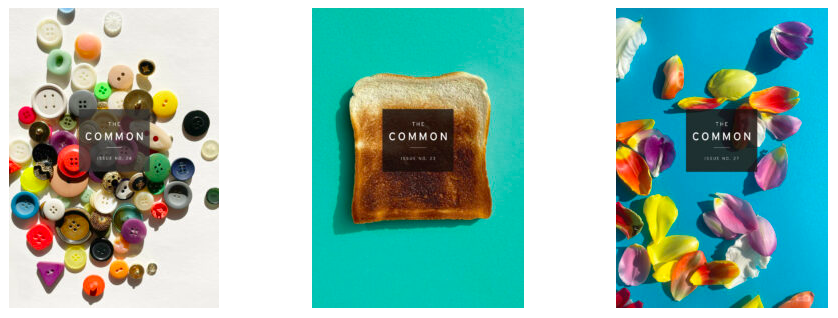
GW: The buttons (Issue 24) were definitely fun. I was biking all over Berlin, and I found this amazing button shop, and I think it was the oldest button shop in Berlin. The woman in there had hundreds of drawers of different buttons. It was incredible. And she had been working there since the beginning of time.
And then the toast (Issue 23)—my son was maybe six years old at the time. And we were putting lots of toast into the toaster and burning it. And he just thought it was the greatest thing ever. I had a lot of variations at the burn, and then I would put it on the paper and shoot it. The issue with the flower petals (Issue 27), that one I made with my son as well. I bought all these flowers, we laid out the paper, and we just pulled the petals off. He thinks it’s really fun, this project I do.
KL: That’s very sweet—the toast is one of my favorites. So I know you most often shoot the covers yourself, but I also know that one of the most recent issues, the soap (Issue 28), we ended up using a stock image for the cover. When do you choose to not shoot the objects yourself?
I do think what’s been so great about the series is that it has been very homemade, which gives us a lot of control over the art and keeps it original.
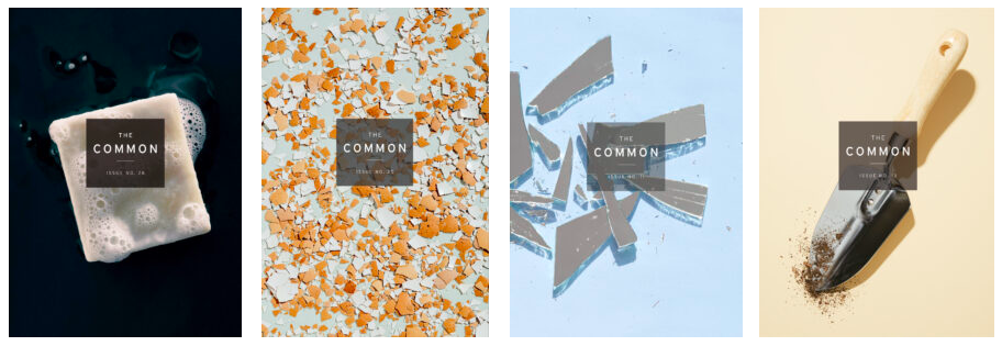
GW: I first tried the soap on my own, and I had bought like 10 different bars of soap. It’s very hard to find a plain bar of soap, actually, without a logo. And when they get used enough for the logo to come off, they don’t look very good. So I put the soap in the bath and tried shooting it a million ways, but it’s very hard to keep the suds looking good and quickly shooting it without getting water all over the paper. So that was one where we decided to use a stock image. The eggshells (Issue 25) was also a stock one. I just thought it was such a gorgeous photo, and I could have probably made that, but it was ready and available, and I didn’t really want to break 100 eggs.
But I do think what’s been so great about the series is that it has been very homemade, which gives us a lot of control over the art and keeps it original. So the goal has always been to make it. And if not, then I’m heavily art directing the shoot and standing with the photographer. The glass shards (Issue 11) was quite exciting to shoot. I broke a mirror that had already been broken because I was like, I don’t want to break a mirror since that’s bad luck. But it was a big mess and then I carefully organized the pieces before working with a photographer, Dominic Neitz, to do the final shot. Dominic, I think, shot Issue 13 as well. His camera is a really beautiful professional camera, so he could get the perfect shadow under that trowel. The trowel photo looks very clean, but it is hard to get the dirt looking just right, and you don’t want to get too much dirt on the paper and ruin it because you need to use it.
KL: Can you tell me more about how designing The Common’s cover differs from designing book covers, and how it’s the same?
GW: If you’re designing a novel cover, you really have to read the fiction very closely. You have to understand the novel—what imagery does it have, what’s the concept of it, what’s the voice of the author, what’s the mood? Let’s say it’s a book that takes place during the 19th century—well, then something on that jacket should relate to that time period, whether it’s like an indication in the font or an indication in the art. You want to represent what’s inside, and I think it’s the same with a literary journal. But there are so many different pieces inside, so many essays, so many images. So I think there’s a little more freedom with designing The Common, where I do think with a novel or nonfiction, there’s this huge responsibility to represent this one big piece.
KL: Can you talk me through your general design process, unspecific to The Common? And would you say you have a style when it comes to design?
GW: Definitely the first thing I do is talk to the client and try to really understand what their book or product is about. I think if you are just relying on what images are in a book, for instance, like, oh, they mentioned flowers, and you put flowers on the cover, you won’t have a very deep design. But if you think about what message is coming through, you’re going to get something that’s more cerebral. I hope that I can design for many different things. I’ve done shoe packaging, I did a diner in the Catskills, and I think I really try to get to the bones of what the client would like to say and distill it into something. My hope is that I’m solving the problems that are presented to me, rather than having a style.
KL: So where do you begin once you feel like you understand what a client is trying to communicate?
GW: I generally start with the typography. When I have a blank slate, I find it really helpful to try to find the personality of the work in the typography. One thing that might be interesting to add is the actual font names we use for The Common. They’re Interstate and Miller, and were sort of popular at the time that the magazine started. But I think they’ve been simple enough that they haven’t gotten out of date—that’s also important, to make things timeless instead of following a style or a trend.
And I guess this is a roundabout answer, but I think just finding balance between all of the elements—between the images, or the typeface, or maybe it’s a really important author and their name needs to be bigger—is crucial. But design elements can also be small and still be really powerful if there is contrast and negative space. I love negative space, and one thing I don’t like is when covers are just so busy that I feel like everything’s lost, and I don’t even know what it’s about. I actually think that’s one thing that’s helped The Common—just the bright negative space and the dimensional objects, because there’s so much going on in a bookstore, I think the things that are less busy are going to stand out.
I’m really honored to work on The Common. I’ve worked on the project for so long now, and I remember when I first started talking to Jen about it, we didn’t know where it would go, or how it would do, and it’s been amazing to watch it grow and have such great authors and artists. I still remember when I first saw it in some great bookstores. And even in Berlin I’ve seen it. I love the freedom I’ve had with it, and the look we’ve established. It’s just a wonderful project to be part of, one of my favorite projects I have.
__________________________________

Issue 29 of The Common is available in print and online.
