Welcome back to Cover Snark!

From Rachael: I have so many questions:
Does she not want him to save her from what looks to be an alligator?
Is that alligator okay? His hips seem off.
Should his gun be that close to the water?
Why are they casually having a moment in this clearly dangerous water??!!
Did they keep their shoes on?
Sarah: She’s a shifter. So is the gator. That’s her brother and she has to talk him out of shooting the gator because again, brother.
Also, how come his shirt is wet at the neck and pits but his pants, which are IN WATER, are dry?
Sneezy: I respect alligators and crocodiles the same way I respect bears and moose – from far, far away.

Sarah: That cover is so disturbing to me. Every time I look at it I get a low-grade ick.
Amanda: Yeah, the shoulder area in particular.
Sarah: Looking again, yup, still ick.
Sneezy: My ick is how OBVIOUSLY COPY AND PASTE they are! THIS IS LITERALLY THE LARGEST AND MOST IMPORTANT PART OF THIS DESIGN!

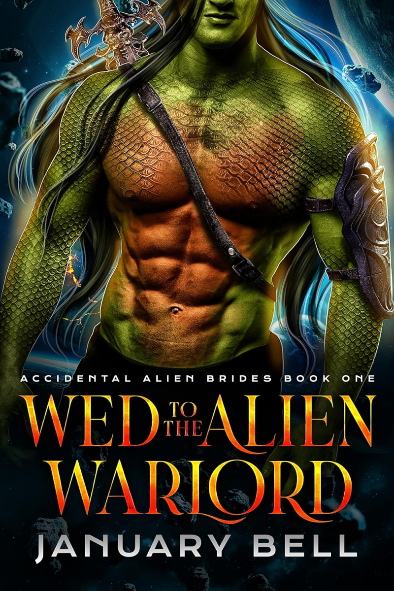
From Lillian P: Green with fish scales? Red belly and abs? Floating in space? And red and yellow font for the title.
Sarah: Someone got reeeeally excited about learning how to use textures in Photoshop.
Amanda: As someone who owned snakes and has touched many a reptile, I don’t know how I’d feel about sexy time with someone with scales.
Sneezy: I’m really into snake people, but only if they have hemi-penises. What’s the point otherwise?

Also from Lillian P: Not one, not two, but three floating aliens all checking themselves out?
Sarah: I’m so sorry I cannot stop laughing at this. It’s so funny. They’re all so pensive! Glowing swords and kilts and a wee-wee stare-off.
Claudia: Oh man I feel we’ve done this one but maybe all the wee-wee staring is blending together!!
Amanda: They all look like they’ve fallen asleep standing up. Like horses.
