Electric Literature is pleased to reveal the cover of The Valley of Vengeful Ghosts by Kim Fu, which will be published on March 3, 2026 by Tin House in the US and HarperCollins in Canada. You can pre-order your copy here.
From the critically acclaimed and award-winning author of Lesser Known Monsters of the 21st Century comes The Valley of Vengeful Ghosts—an eerie, spellbinding novel of grief and guilt, with a razor-sharp eye for the absurdity and melancholy of the internet age.
In the aftermath of her mother’s death, Eleanor is unmoored. For years, her mother orchestrated every detail of her life—from meals, to laundry, to finances—so that Eleanor could focus on her career as a therapist. Left to navigate the world on her own, Eleanor clings to her mother’s final directive: use her inheritance to buy a house.
Desperate to obey her mother one last time, but finding few options she can afford, Eleanor impulsively buys a model home in a valley-turned-construction site, a picturesque development steeped in a shadowy history. It feels like a fresh start, until the rain comes—an endless, torrential downpour. As water seeps in through the house’s cracks, the line between what is real and what is not begins to blur. Haunted by the stories of her patients, a stream of workmen and bureaucrats she can’t trust, and visions of ghosts from her past and present, Eleanor’s reality unravels, and she is forced to reckon with the secrets she’s buried and the desperate choices she’s made.
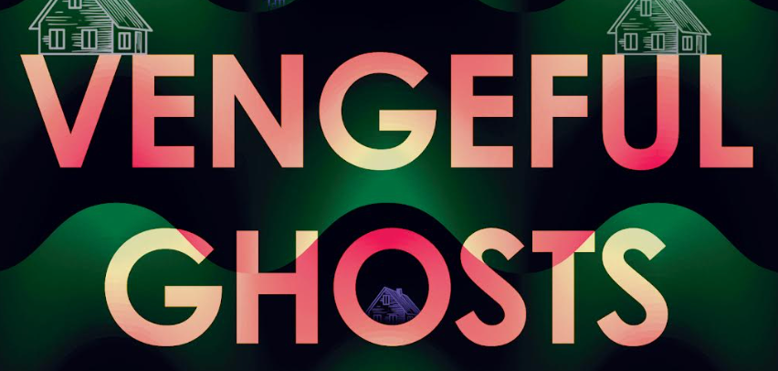
Here’s the cover, designed by Beth Steidle:
Kim Fu: While writing and editing, I often try to think about how a first-time reader would experience the words that are actually on the page, rather than how well I have realized any preexisting vision or intention. When I first received this cover, after a gut positive reaction, I tried to assess it the same way. As opposed to “is this the cover I expected?” I tried to think, “if I were a reader walking through a bookstore, and I came across this book knowing nothing of its contents, how would I react?”
There’s something immediately attractive about this cover; the intense colors and loud typeface would call to me from a shelf, beckoning, hard to ignore. The title sounds like horror, but the design suggests unease, an off-kilter, ironic edge, rather than gore or grit. The pale peach of the text is at first a pretty, gentle hue, evocative of sunset, but as the semantic meaning sinks in—vengeful—the letters instead begin to look burnt or marked or injured by the reds and pinks. The repeating, translucent houses are ghostly but also impish, resting upon the lettering, peeking out from within the O, the lit windows in the rain beaming out from the cover like eyes. The graphic, unreal quality of the bright blue rain and bright green, perfectly even rolling hills, the archetypical house shape—a child’s conception of rain, hills, houses—suggest that the book has a fable-like quality: the house is not a specific house, but the idea of a house; the rain isn’t the clear water that falls from the sky, but a mythic force, rain as it appears in dreams, fantasies, parables. Despite all the bold color, black dominates the background, shadows overtaking the hills and seeping through the text. The cover is subtly in conversation with the cover of my last book, Lesser Known Monsters of the 21st Century—they would look beautiful side by side—while also wholly new and distinct.
It’s perfect, I thought.
Early on, I’d talked with my editor at Tin House, Masie Cochran, about a couple specific images from the book as potential covers: a chandelier dripping with water, an impossibly large deer buck standing in a kitchen. The novel was also inspired, in part, by a recurring nightmare I had about a house made of sugar dissolving in the rain. In addition to being spoilers (and a little too on-the-nose), what these images have in common is a sense of corroding beauty, disillusion, a slow-burning realization that things aren’t quite right. We agreed that a “dark” cover was the obvious choice, but what if, Masie suggested, it was almost painfully bright instead? I liked these ideas, but I had no idea how they would come together.
Beth nailed it. Already this cover is inextricably tangled with my conception of the story, with Eleanor’s fears and inventions and the unfolding of her life. I can feel Beth’s ghost houses watching me in the dark.
Beth Steidle: I was so struck by Kim’s novel and the way that profound loss—loss of parent, partner, job, and home—is explored through an almost mythic landscape: the skeleton of a housing development, an abandoned valley, shifting mountains, all plagued by a relentless, torrential downpour. Because the narrative is deeply personal and inhabited by morally complex, often frustrating characters, I first thought that the cover should feature one or more distorted figures. But ultimately, it felt more fitting to portray the setting, as this place embodies the magnitude of the book’s events and the inner turmoil of the protagonist. The wavy green pattern is meant to invoke hills but also to feel undulating, like the flood that is coming from the strangely bright rain just beginning to pour down. The houses are ghostly and almost fleeting, while the singular house with its lights on hints at a lonely human presence, someone trying to survive in a dark and surreal place.
Take a break from the news
We publish your favorite authors—even the ones you haven’t read yet. Get new fiction, essays, and poetry delivered to your inbox.
YOUR INBOX IS LIT
Enjoy strange, diverting work from The Commuter on Mondays, absorbing fiction from Recommended Reading on Wednesdays, and a roundup of our best work of the week on Fridays. Personalize your subscription preferences here.
