Electric Literature is pleased to reveal the cover of Waiting on a Friend by Natalie Adler, which will be published on May 26, 2026 by Hogarth. You can pre-order your copy here.
Renata is a young dyke-about-town who can see ghosts, something she’s doing more and more of lately as too many of her friends are dying of a new, terrifying disease. When Renata’s best friend Mark dies of complications from AIDS, Renata is devastated by the loss of the person she loved most in the world. And to her disappointment and increasing despair, Mark seems unwilling or unable to return for the proper goodbye they both were denied.
While Renata waits anxiously for Mark, she must stay vigilant: a mysterious, police-like force has begun ridding their East Village neighborhood of anything abnormal or inexplicable. What first seems like a scam reveals itself to be far more sinister, targeting the soul of Renata’s community. With her band of lovably eccentric pals and lovers, Renata is determined to fight back against the erasure of her friends’ memories and the sanitizing of her beloved New York. But haunting her every step is Mark, the one ghost who stubbornly refuses to reappear.
Both heartbreaking and healing, tragic and triumphant, Waiting on a Friend is a magical retelling of queer history and a celebration of youth and camaraderie. With pathos and humor, empathy and an edge, Natalie Adler freshly reimagines the past for a new generation, reclaiming the spirit of resistance and determination that would become one of the era’s defining legacies.
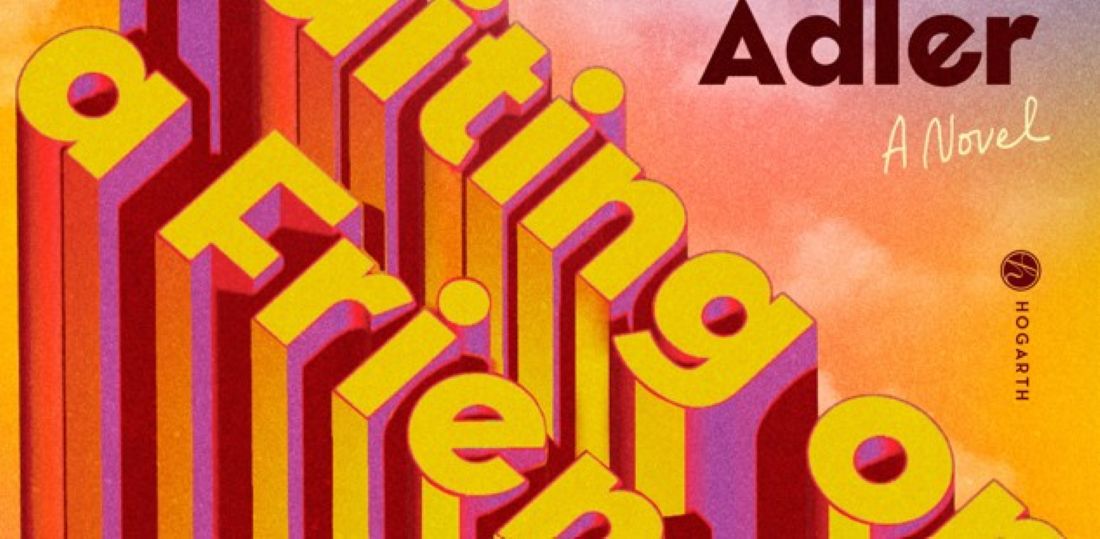
Here is the cover, designed by Cassie Vu:

Natalie Adler: Waiting on a Friend is a novel about the kind of friends you make when you’re young and on your own, who transcend familial or romantic boundaries. Throughout the AIDS crisis, such friendships were the height of care. I dedicated the book to my aunt, who became a hospice nurse in 1987 after her friend died of AIDS. This book is for people like her, driven by fierce love for those who have been let down by indifferent systems (which is to say, everyone). I also wrote it with my friends in mind. I hope queer and trans readers born during or after the AIDS crisis learn more about their historical inheritance and I hope the generations who lived it feel their struggles have been remembered and honored. And I want everyone who reads this book to feel the joy of belonging to a neighborhood, even as what makes it home is being changed by forces aligned against you—and to imagine the exhilaration of fighting back. What do we owe one another? How do we mourn our dead while also fighting for the living?
The cover for Waiting on a Friend promises the vibe inside: alternately bright and moody with a hint of mystery. The title does a lot of work in letting readers know what the novel is about, so it’s prominently featured here. The novel is very much about living in a city where so many lives have passed through and how gentrification erases the traces of those lives. I tried to capture both the tough material realities of New York and the ghostly sensation of sharing it with something unseen, but no less present. Cassie did such beautiful work in illustrating that feeling. The cover graphically references both the architecture and the ephemerality of city life. The texture and font are both a little vintage without being overly nostalgic. (If there’s nostalgia in this novel, it’s for a time where we could all afford to live and go out in the same neighborhood with our friends without having to work too hard.) The sunset colors suggest a gorgeous moment in time but also a sense that something is slipping away. My dream is to see someone reading my novel at golden hour at Riis or the Rockaways or on the Q train crossing the river.
Cassie Vu: For this cover, I actually read the manuscript a full year before I got to work on it, during a time in my life when I really related to the journey of the main character. I think it might be the first time this has happened to me, but I had the general idea and the concept for the cover floating around in my mind months before I sat down to design it. The book gives such a strong sense of place, Manhattan in the 1980s, and the writing has an emotional quality to it that deeply resonated with me, so all I had to do was tap into those emotions and visually depict it for the sketch phase. The colors and shapes of the letters are meant as a nod to the vintage time period, while still feeling fresh. The chosen cover was actually the first option I made when I started designing. Sometimes it just clicks!